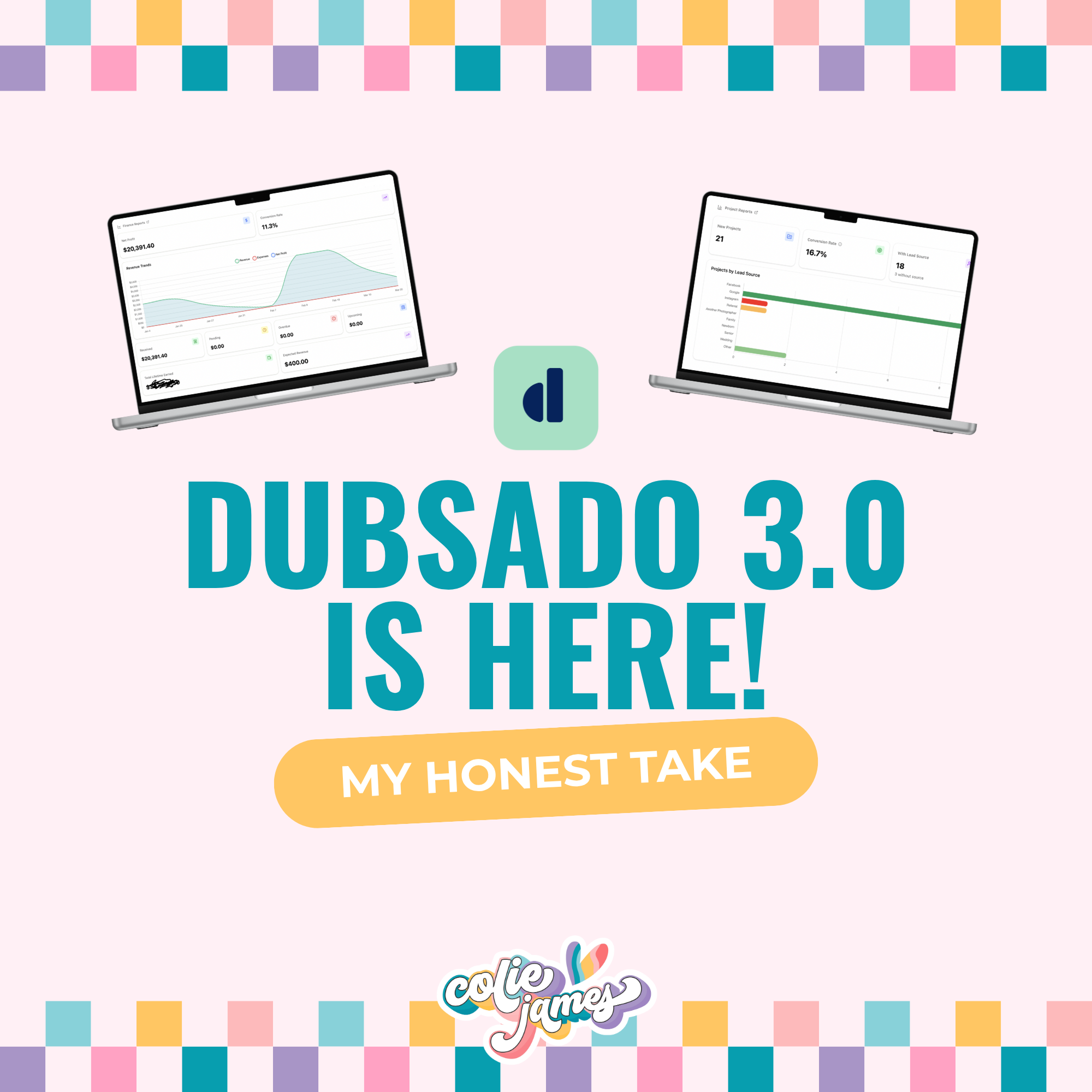


If you logged into Dubsado this week and immediately felt assaulted by the brand-new 3.0 interface… you’re not alone.
And good news:
You can switch back to 2.0.
Just go to hello.dubsado.com and everything will look and function exactly the way it did before.
So whether you’re ready to explore 3.0 or you’re still clinging to 2.0 like a security blanket, you have options.
And if you are ready to jump into 3.0 — or you want the facts before you decide — let’s get into what you actually need to know.
(Also, this blog post is a work in progress. As Dubsado rolls out updates, fixes, and new features, I’ll be updating this post. Bookmark it if you want the most current info.)

Dubsado 3.0 is officially here, and honestly?
I am equal parts thrilled and frustrated.
There are features I’ve been begging for (LOUDLY) for years… and none of them made it into 3.0. Not yet, anyway.
But there are some seriously good improvements, and I want to give you both sides:
- What 3.0 still doesn’t do
- What 3.0 actually does
Let’s start with the “ugh, we’re still waiting for this” list — because I’m not sugar-coating what 3.0 isn’t.

What Dubsado 3.0 Still Doesn’t Do (But Should)
🛑 You still can’t book a client with a scheduler + contract.
I know, I know. You’ve heard me say this before.
This is a must-have for photographers, especially for:
- mini-sessions
- high-volume studios
- quick turnaround bookings
HoneyBook has it. Smaller CRMs have it.
Dubsado still does not.
There are a few good scheduler updates (we’ll get to those), but this one still hurts.
🛑 We still don’t have true conditional logic inside workflows.
“Yes, when form not completed” is the GOAT.
Yes, I’m grateful for it.
BUT.
Imagine a world with:
- when appointment not scheduled
- when task is not completed
- when client ghosts
- when contract still unsigned
Conditional logic heaven.
We’re not there… yet.
(I’m still manifesting this harder than anything in my business.)
🛑 Appointments and project dates are still separate.
This one makes me wild.
HoneyBook and 17hats let you click one button → appointment becomes the project date.
In Dubsado? Still separate fields. Still manual. Still confusing for clients and workflows.
This is #2 on my JUST GIVE IT TO ME ALREADY list.
If your Dusbado workflows keep failing to do it’s job, you might be using the Dubsado workflow appointment date triggers incorrectly!
🛑 Workflow emails still can’t send to the main client + alternate contact.
Wedding photographers, I see your pain.
Couples = two humans.
Projects = one main email.
You still can’t automate messages to both.
The good news?
This has been announced as in progress, so there is hope.
🛑 Still no separate calendars/emails for team members.
This one doesn’t impact me personally, but it matters for studios, associates, and multi-photographer teams.
This was one was also announced as in progress by Dusbado in this Thread 🎉

Okay. Deep breath. Rant over.
Now let’s look at what 3.0 does give us.
Once I got my initial “BUT WHERE ARE MY MOST-WANTED FEATURES?!” feelings out of the way, I started exploring 3.0… and wow, there are some genuinely impressive upgrades.
Things that make your day easier, faster, and less chaotic — even if they’re not the “dream list” features we’re all still hoping for.
What’s New (and Actually Awesome) in Dubsado 3.0
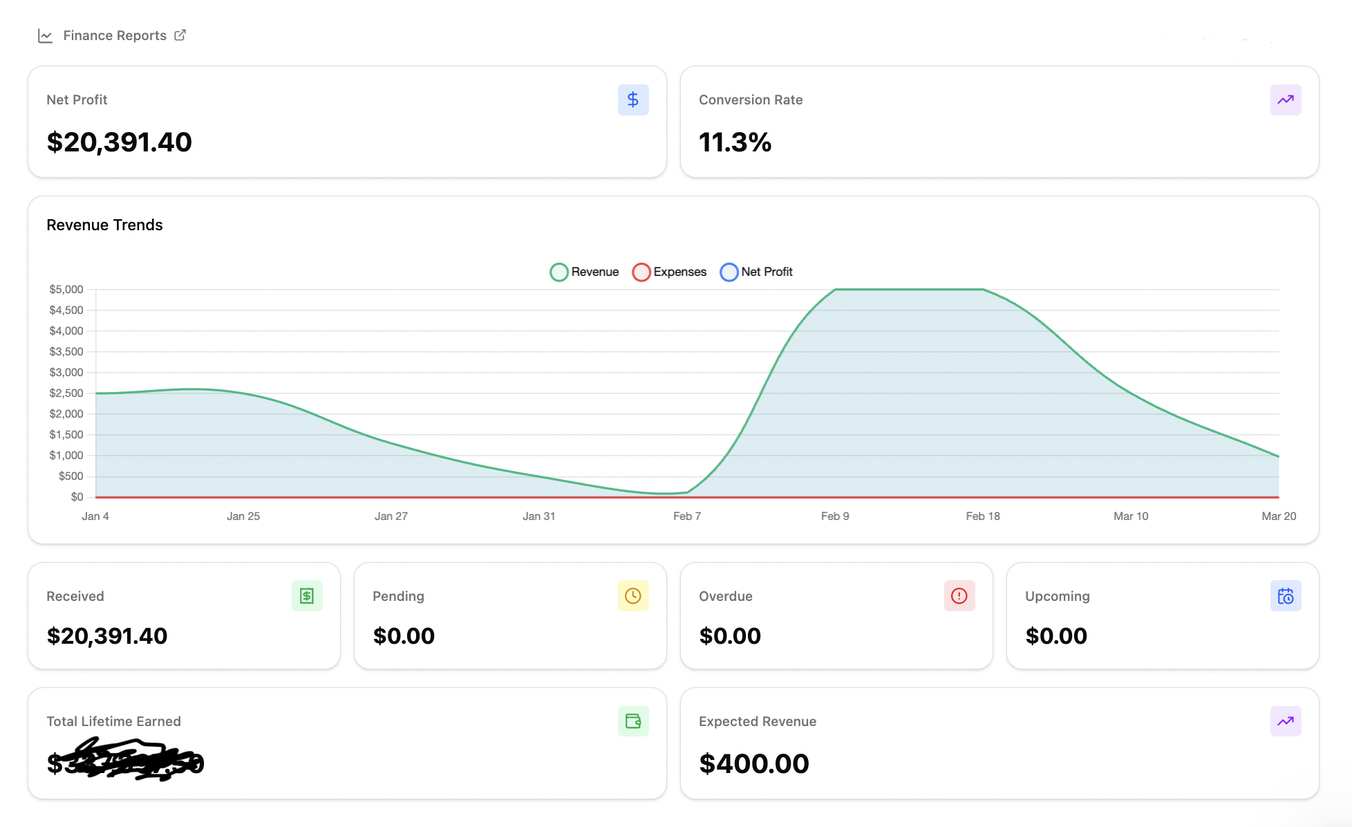
1. A brand-new Home page (a real dashboard replacement!)
Let’s start with the biggest complaint I’ve seen on Threads, because it deserves attention:
“WHERE THE HELL IS MY REVENUE INDICATOR?!”
If you felt personally victimized by its disappearance, let me reassure you:
It’s still there.
It’s just further down on the new Home page.
Now… should it be that far down?
In my opinion: absolutely not.
If the past few days of Threads posts have taught us anything, it’s this:
People are not playin’ ’bout their money. 😂
Dubsado — if you’re listening — the people want their revenue tracker front and center again. Preferably with the ability to set their financial goal. Preferably yesterday.
UPDATE: They already fixed this.
Because photographers want to see the number the moment they log in:
- How much have I made this year?
- How close am I to my goal?
- What’s my trend for the month/quarter?
That information is motivational fuel, and right now it requires scrolling.
Alright, now that we’ve covered the hottest take of 3.0, let’s talk about the rest of the Home page experience — because it’s actually really, really good.
The redesigned Home is bright, clean, customizable, useful, and genuinely pleasant to look at. You get:
- quick actions
- universal search (shortcut ⌘K)
- meaningful financial data
- lead source insights
- recently accessed items (with details)
- a layout that finally feels intentional
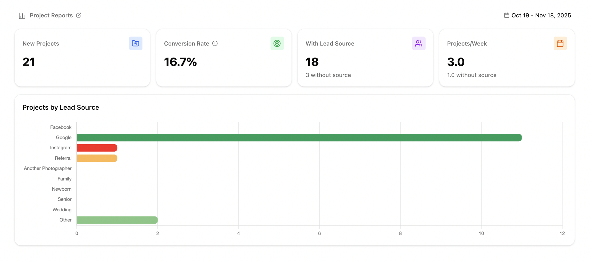
I’ll be breaking this down in detail in a follow-up blog post, but the biggest improvement IMO is… customizable sections. That’s right! If you click on Display Settings you can reorder these sections or hide any you don’t want to show.
2. A real Messages area (inbox, sent, unread, archive)
This is one of the biggest glow-ups in the entire update, an inbox.
You now have:
- a proper inbox
- a sent folder
- an unread folder
- an archive
- the ability to send emails outside projects
- the ability to reassign emails to the correct project
- easy access to templates
- dedicated email settings
It’s nice to see client communication centralized, without several clicks to get inside each project.
3. A brand-new Flows builder (formerly Workflows)
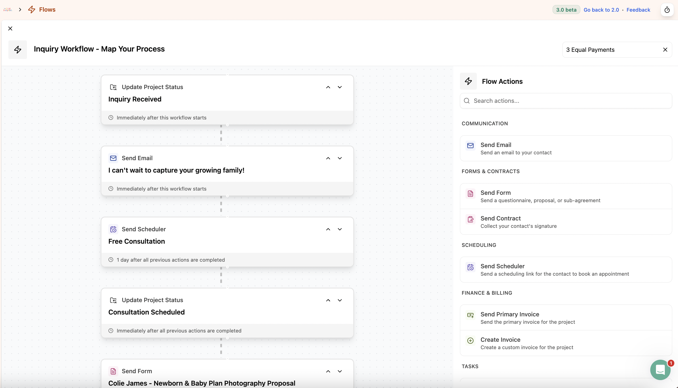
No new triggers.
No new actions.
Same functionality.
But the layout?
Clear. Visual. Intuitive.
Click and drag 😍
And 100% built to support future conditional logic.
As you know, conditional logic is the only thing I’ve ever actually prayed for, so I am choosing hope here.
4. Time tracking from anywhere
Small but mighty.
If you track billable time, this saves clicks every single day.
No more clicking Utilities > Time Tracking to start.
Access the tracker from anywhere in Dusbado.
5. A better scheduler (recurring availability!)
If you’ve ever:
- deleted 9–5 blocks one by one
- rebuilt your entire weekly availability
- clicked “remove” 47 times
- adjusted each day individually
…recurring availability will change your life.
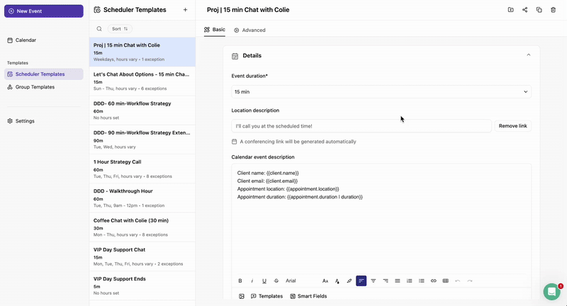
Set it once → it copy it to other schedulers with two clicks.
It’s not the same as default universal availability you can apply to multiple schedulers at once, but I’ll take it.
This single feature makes the scheduler feel SO much more modern.
Side note: Might seem petty, but WHERE is my Group Scheduler welcome banner? I want to be able to customize the greeting on a group scheduler landing page.
6. The Projects view is rough for me right now
I was never a huge fan of how statuses looked in 2.0, but 3.0 is so different that my brain is fighting it. It’s not bad… it’s just a big, jarring shift, and it’s hands-down the thing I’m struggling with the most in this update.
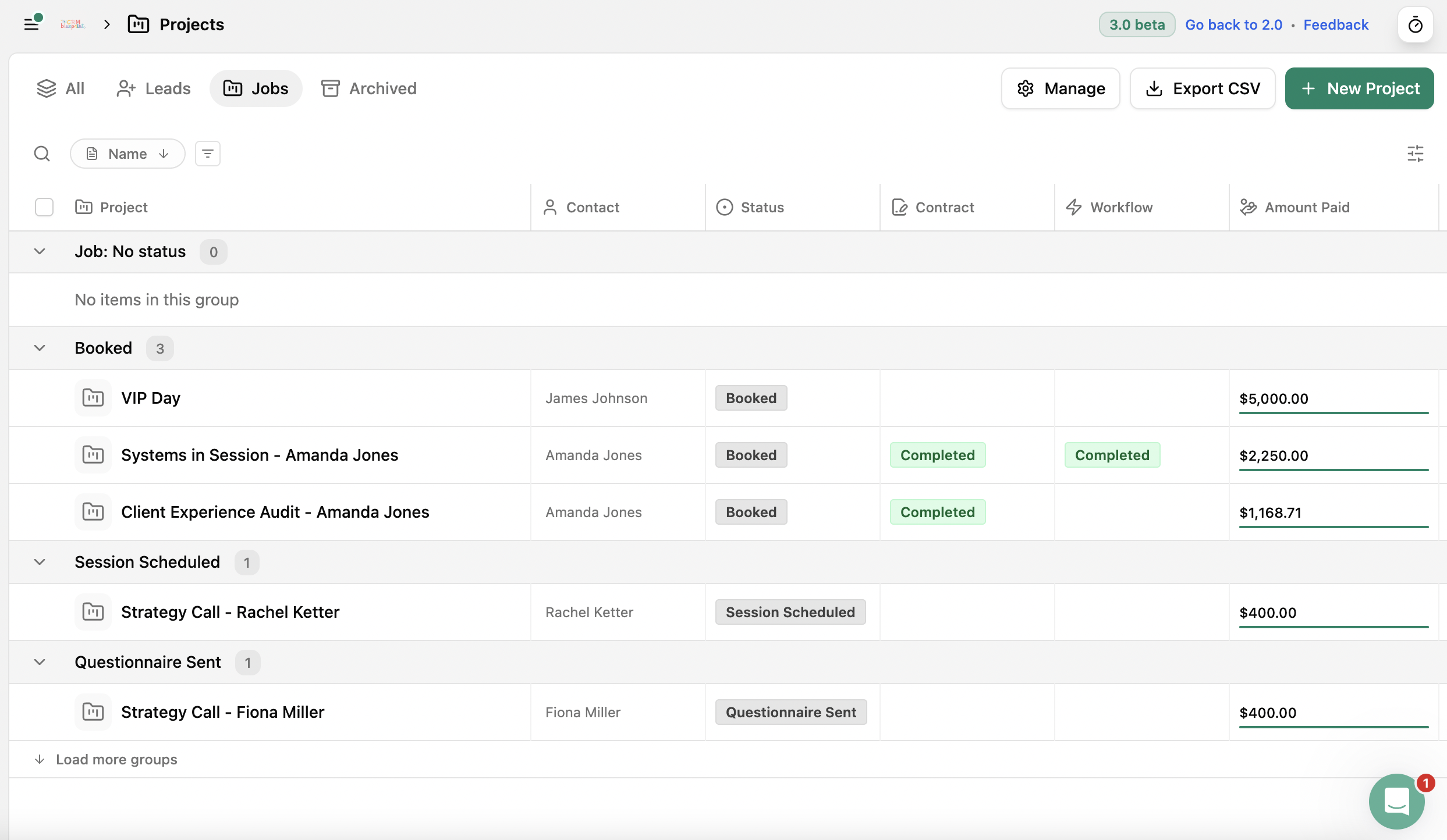
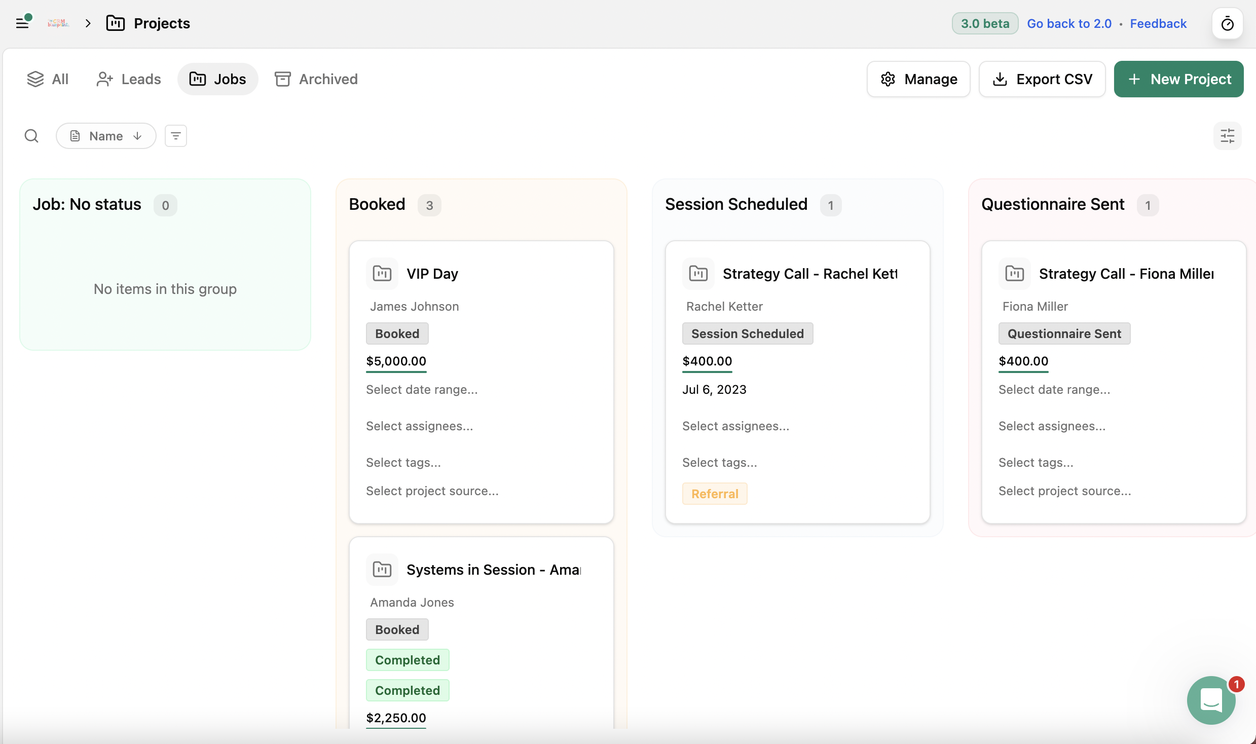
- LOVE the board view, but it feels so cramped on my screen.
- LOVE the collapsable statuses
It’s just weird not seeing the statuses at the top of the screen.
The biggest adjustment for me is inside individual projects. You still have the tabs across the top — Messages, Invoices, Tasks, Events, Forms, Flows, and Notes — but now when you click into any of them, the details no longer appear in a sidebar. Everything takes over the full screen. Makes it easy to forget which client you are working on.
The information that used to live in the project sidebar in 2.0 has been moved to a new Project Details page in 3.0, but the balance between the details and the activity feed feels off. It reminds me of a very stripped-down version of a HoneyBook project page.
I’ll save my full rant + walkthrough on the projects view for the next blog post 👍🏽
Final Thoughts Before We Dive Into the Full Series
So yes — Dubsado 3.0 is not perfect.
It didn’t deliver:
- scheduler + contract
- true conditional logic
- joint workflow emails
- unified appointment/project dates
- team calendars
But you know what it did deliver?
A real rebuild.
A cleaner foundation.
A version of Dubsado that’s faster, clearer, more intuitive, and ready for future features.
3.0 is a reset — and honestly?
A really good one.
And they’ve announced these features are in-progress: SMS messaging, conditional logic, multi-client projects, and global brand settings.
This post kicks off my full Dubsado 3.0 series.
Up next: Part 2 — Managing projects inside Dubsado
Frequently Asked Questions About Dubsado
Dubsado is a popular CRM for photographers, and for good reason. It helps you manage your clients, projects, and workflows all in one place. Here are some frequently asked questions about Dubsado:
Should you switch to Dubsado 3.0?
If you are an existing user, you can log into your account using hello.dubsado.com to access the old 2.0 interface. If you area new user, 3.0 is the only option going forward.
Is Dubsado easy to use?
While there is a bit of a learning curve, Dubsado offers plenty of tutorials and a supportive community (like me!) to help you get the hang of it. But, if you find yourself feeling overwhelmed setting it all up, why not design and implement your client experience together inside Systems in Session?!
Explore More Dubsado Resources for Photographers
- 3 Common Errors Breaking Your Dubsado Workflows
- How to Switch from Honeybook to Dubsado Without Losing Your Mind
- Avoid These 3 Common Client Experience Mistakes in Your CRM
- Honeybook vs Dubsado: Which One is Better for Photographers
- 4 Dubsado Templates for Photographers That Want More Time Back in Their Life
- How to Use Dubsado – A Behind the Scenes Look Inside My Photography Business
- 5 Things I Wish You Could Automate Inside Dubsado [Turns out there are more LOL]
- How to Improve Your Client Experience: A Breakdown of My Audit Process
- From Touchpoints to Timelines: How to Begin Mapping Your Client Experience
- How to Design Workflows That Enhance Your Client Experience
- How to Create a 5-Minute Booking Process Inside Your Client Experience


Top Categories


© 2022-2025 Colie James


Close
Start dates available for Q1 2026
Enter your contact information to join the interest list for Systems in Session. You will get early access as spots become available with a booking bonus!